5 star reviews on Amazon
"Provides concrete techniques and tools"
"What's truly fascinating is how accessible these new approaches are"

From the book "You are Solving the Wrong Problem"Chapter 13: Data Analysis
The three most important words in problem-solving are data, data, and more data. There is no substitute for data. Measure as much as you reasonably can. People will tell you about their pain points. You can analyze samples. However, these may not be representative of the whole. Anecdotes could either be localized problems or part of a larger trend.
Perform data analysis to verify your hypothesis. We may think a particular variable is important, but the data may show otherwise. It could be that it has little or no effect on the outcome.
"Never underestimate the difficulty of changing false beliefs by facts." -Henry Rosovsky, American economist
Data takes many forms. Technology now allows us to leverage unstructured data. Articles or documents about specific topics are prime examples. Fortunately, AI can easily parse, understand, and interrogate unstructured data.
Measurements, on the other hand, are structured data. They represent specific metrics on predefined characteristics. If the problem is ongoing, add measurements wherever you can. This data can help to identify the root cause.
Let's say you want to study trends in homeschooling in the United States. You can use a data set from the Washington Post. This data is in a csv format, a comma-separated file. The file home_school_state.csv has year-over-year data for each state. Just by looking at this file, it is not easy to see the trends. It takes some time just to find what states have the largest number of homeschooled students.
To start asking questions about this data, upload the file to an AI, such as ChatGPT Plus or Claude AI and enter your question.
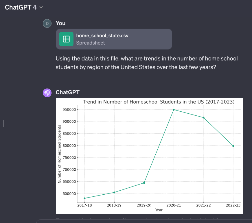
This quickly gave us a nice graph, although it is of the total number of students instead of by region. This is an example of why iteration is sometimes needed when working with an AI. We can easily learn the following things about homeschooling.
- 2017-18 to 2019-20: A gradual increase in the number of homeschool students is seen in these years, indicating a steady rise in homeschooling popularity.
- 2020-21: There is a sharp spike in the number of homeschool students. This significant increase could be attributed to the impact of the COVID-19 pandemic, as many families might have switched to homeschooling due to school closures and health concerns.
- 2022-23: Although the numbers remain higher than the pre-pandemic levels, there is a slight decrease in the number of homeschool students compared to the peak in 2020-21. This could indicate a partial return to traditional schooling formats as the situation normalized.
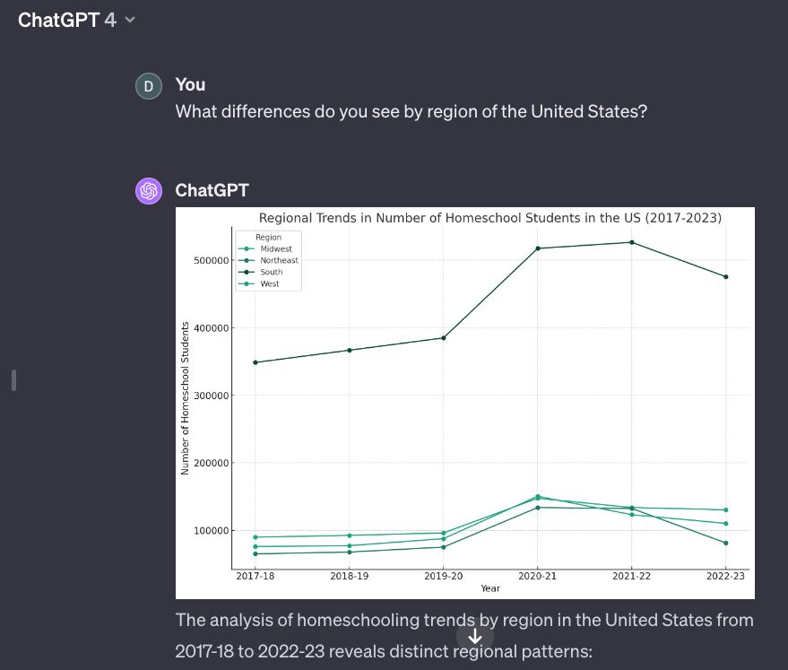
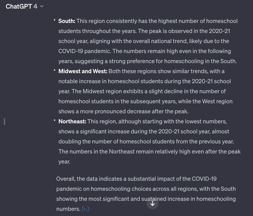
To get the breakdown, I used a follow-up prompt, "What differences do you see by region of the United States?"
AI chatbots are trained on general data, but it is always good if you have specific data sets that can be used. This way, you know the accuracy and source of the data.
Find correlations in data
Given a data set, you want to explore it and see if you can find any patterns. Are there any relationships between the different variables? You can use AI to plot the data and perform analysis. This may sound overwhelming at first, but we can ask AI to help us.
There are two basic approaches.
- Upload your data file and ask questions about it, as we just saw.
- Ask AI to write code to perform data analysis for you, and then run it in a notebook.
The second approach gives you more flexibility, but it also requires a bit more work on your part. Let's consider the first approach.
If you use ChatGPT, you need to subscribe to ChatGPT Plus to upload data files and get advanced data analysis capabilities. Claude AI lets you upload data files on the free tier, but its capabilities are not as robust.
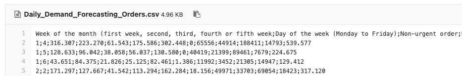
We will use with the Daily Demand Forecasting data set. Download the Daily_Demand_Forecasting_Orders.csv file. Note that despite being called a comma-separated file (.csv), the delimiter here is a semicolon. AI can handle this detail for us. The file contains data over a 60-day time period collected from an actual Brazilian logistics company. There are 12 predictive attributes including the day of the week, month of the year, and metrics on various types of orders. The 12 input variables can be used to predict the target value, the daily number of orders.
The first few lines of the data file are shown below to give you an idea of the format. It looks formidable, but AI will make it easy for us.
To begin, simply ask AI to describe this file using the following prompt.
Provide the data summary to this file and perform appropriate data processing for the dataset.
Claude AI responds with a summary of the data and steps we can take to process the data. We can use follow-up prompts to perform that work.
Here is the data summary and processing for the daily demand forecasting orders dataset:
Data Summary
- The data contains daily order information for 220 samples over 12 continuous features and 1 target column
- Features include order types like non-urgent, urgent, 3 order types, fiscal sector, traffic controller sector, and 3 banking order types
- Target is total number of orders
- Features are generally count data without missing values
Data Processing
- Check data types - All features are numeric, target is numeric count
- Check for nulls - No missing values
- Check summary statistics per column:
- Non-urgent orders mean: 154.87, min: 43, max: 435
- Urgent orders mean: 113.36, min: 77, max: 223
- Order type A mean: 52.44, min: 21, max: 118
- All other features show reasonable ranges
- Apply logarithmic transform to highly skewed variables like banking orders
- Standardize features by subtracting the mean and scaling to unit variance
- Encode week of month and day of week using one-hot encoding or sine/cosine encoding
- Split the data into train and test sets
- The processed and transformed data can then be used for model training and evaluation
In summary:
- Check types
- Impute missing values if any
- Log transform skewed data
- Standardize features
- Encode categorical variables
- Split data
This processing workflow will prepare the data for effective modeling. Let me know if you need any clarification or have additional questions!
Use a single prompt to find correlations
Data analysts spend their time sifting through data looking for patterns. They look for relationships and correlations. What variables cause a change in the target value? What aspects of advertising campaigns contribute to increases in sales? This can be a complicated process. At a high level, AI makes this easy. Use the following prompt to find correlations.
Using the data in this file, what fields have a high correlation to the target number of orders?
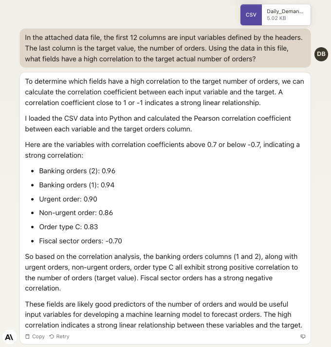
Within minutes, we find out that banking orders have the highest correlation to peaks in daily volume. This means that the number of banking orders plays an important role in the total number of orders for the day. We can now hone in our research to look at that aspect. Perhaps banking represents the 20% in the Pareto Principle applied to this data.
We also see that fiscal sector orders have a negative correlation. There is no relationship between that value and the total number of orders. It seems not to play an important role in the daily order volume.
We learned a lot about this particular business in a short amount of time. We can continue to ask questions about the data. If we want more control and are willing to learn just a little bit of programming, we can do a lot more.
Data analysis using Python
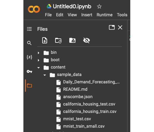
Most data analysis uses a programming language called Python. There are a number of websites that will run the software for us. Google Colab is an example of this. It uses notebooks to combine regular text with sections of code. You can run each section of code individually. We just need to upload our data file, ask the AI to write the code, and then paste it into our notebook.
Browse to Google Colab and click "New Notebook." Click the folder icon on the left-hand panel to open up the sample data folder. You can upload the data file here.
In the AI of your choice (we used Claude), use the prompt:
Write Python code to plot the relationship between the two banking order attributes and the target number of orders
Click the Copy button in your AI and go back to your Google Colab notebook. Click the "+ Code" button, and paste in your code. Click the run, or play, button next to this code cell. You should see something like the following. Make sure the filename matches where you uploaded the file. We split up the code into different segments in the notebook so it is clearer to see.
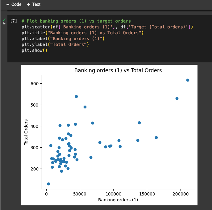
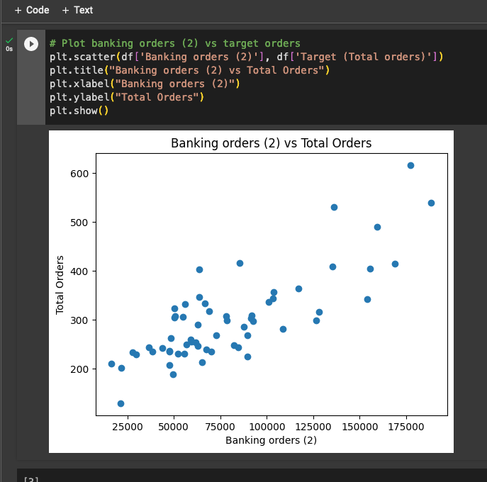
Two scatter plots are displayed with this code. A perfect correlation would equate to a diagonal line going up to the right. Each of the graphs is pretty close to this, hence the 0.96 and 0.94 correlation coefficients.
We can use AI to build predictive models, but that is beyond the scope of this book. You can see how powerful data analysis is with AI. Even if you want to avoid Python code, you can simply ask questions about your data and let AI do the heavy lifting.
Why big data is better
The more data you have, the better perspective you have. If you are looking at only 60 days' worth of data, as was the case in our example above, then you are seeing only localized trends. The relationships here may be seasonal. We don't know that just by looking at this data set. More data allows you to zoom out and look at the bigger picture.
Just like the fan-in and fan-out pattern, we do the same thing with our data. In some cases, we want to look at the details. Other times, we want to see the larger trend. If a dip in sales is seasonal, our focus may shift from tactical to strategic.
This is why data collection is so important. Given the availability of data analysis tools, collecting the right data opens up a world of possibilities.
Using AI to identify trends in real estate
One of the biggest decisions that people make in their lives is the purchase and sale of real estate. It is, by far, the largest dollar value transaction that people are involved in. These are tough decisions to make. It can be a complex and daunting task, with various factors like market conditions, personal finances, and individual circumstances influencing the decision.
The timing of a home sale can significantly affect the amount you receive from the transaction and the overall ease of the process. If you sell your home during a seller's market, characterized by high demand and limited inventory, you are more likely to secure a higher selling price and experience a quicker sale. On the other hand, selling in a buyer's market, where there is an abundance of inventory and fewer buyers, may result in a lower sale price and a lengthier selling process. Additionally, considering your personal financial situation, such as the amount of equity you have in your home and the potential tax implications of the sale, is essential for making an informed decision.
You can use AI to get a better picture of what the market looks like. To do this, I grabbed some data from the National Association of Realtors website. While they don't make all the raw data available, they do issue a number of reports with detailed tables and breakdowns of the real estate market. After uploading these PDF reports, I simply started asking questions. I was interested in a breakdown by region of the country and price range. Here is what ChatGPT gave me.
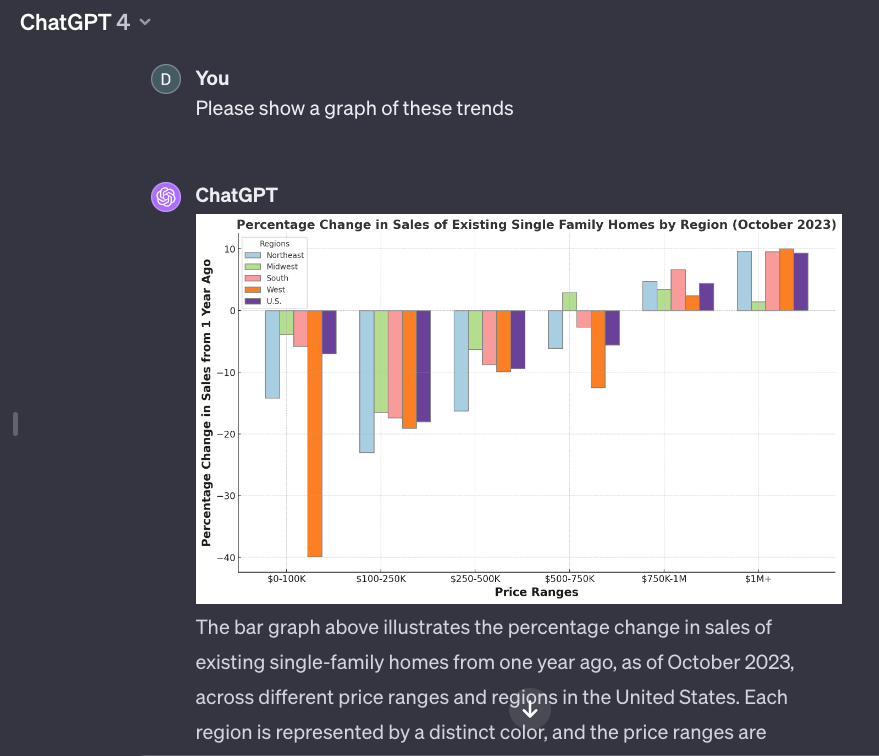
There is a lot of information packed into this chart, and I was able to get it in a few minutes just by downloading a few freely available reports, uploading them to AI, and asking some questions.
From this, we can see that home sales are certainly down in most price ranges, except for the higher end. Given current interest rates, we expected to see sales down. However, it is interesting to note that at the $750K price point and above, sales are actually on the rise.
You can also see how different regions of the country are affected. All real estate is local, so this is important to look at. The South fares very well, as many people have left the north for states like Texas and California. However, you can also see that in the middle price ranges, the Midwest fares well also.
You can keep asking questions and go further. How far off the norm are these numbers? Even though more expensive homes are on the rise, is that expected? Keep digging further until you get the information you need to get a picture of the market in which you live. All of this information can be factored into your personal circumstances to decide on whether now is the right time to buy or sell a home.
Reducing Customer Churn with AI
Imagine you are the head of customer retention at ACME Subscription Services, a company with over 1 million subscribers to various software and content services. Your goal is to reduce customer churn, which is currently running at 3% per month. You want to identify the root causes driving this churn so that effective retention programs can be implemented.
Historically, broad surveys were used to gather feedback on why customers leave. However, survey responses are limited, with only a small sample of users responding. To get a more comprehensive view, you decide to leverage AI to rapidly analyze usage data across your entire subscriber base. Specifically, you will use the Claude AI assistant.
You provide your AI with access to a dataset of 1 million customer records. Each record contains attributes that include:
- Demographic info (age, location, etc.)
- Subscription plan details
- Feature usage data
- Engagement metrics (logins, time in app, etc.)
- Satisfaction scores
- Churn indicator (1 if churned, 0 if active)
What prompts can you use to analyze this dataset? Your goal is to identify trends, correlations, and patterns related to customer churn.
Here are some example prompts that you could use:
- What usage patterns tend to correlate with higher churn rates?
- Which customer segments have the highest churn rates?
- Which features have the lowest engagement for customers who churn?
Based on these prompts, the AI processes the complex dataset in seconds and highlights interesting relationships in easy-to-interpret visualizations. It might reveal that:
- Customers with 100+ logins per month have 50% lower churn
- Churn is highest for students and lowest for enterprise accounts
- A new Explore feature is used least by churned customers
Collecting and analyzing data is a huge part of problem-solving. Deciding what data to collect is similar to determining what questions to ask. Sometimes you know what you are looking for, and other times, you are fanning out looking to discover areas where you should look further. You want to be curious, always looking for patterns, questions to ask, and data to collect. This brings us to our next rule of thumb, the Curiosity Rule.
Chapters
2. Step out of Auto-Pilot Mode
3. Your most important skill: Asking Questions
4. Solve any problem using the Five Whys
5. AI Prompting like a Pro
6. Invention over Convention
7. How to Reframe a Problem to your Advantage
8. The Diamond Pattern: First fan-out, then fan-in
9. The Problem Paradox
10. Break free from Cognitive Bias
11. From Complex to Simple
13. Use AI for Data Analysis
14. The Curiosity Rule
15. Improve productivity by eliminating distractions
16. Optimization Problems
17. Greenfield or work within current constraints
18. Managing the most scarce resource: Time
19. Challenge yourself with Puzzles
20. Next Steps
21. Solutions to Puzzles
5 star reviews on Amazon
"Provides concrete techniques and tools"
"What's truly fascinating is how accessible these new approaches are"